
05 Case study
Ketabook
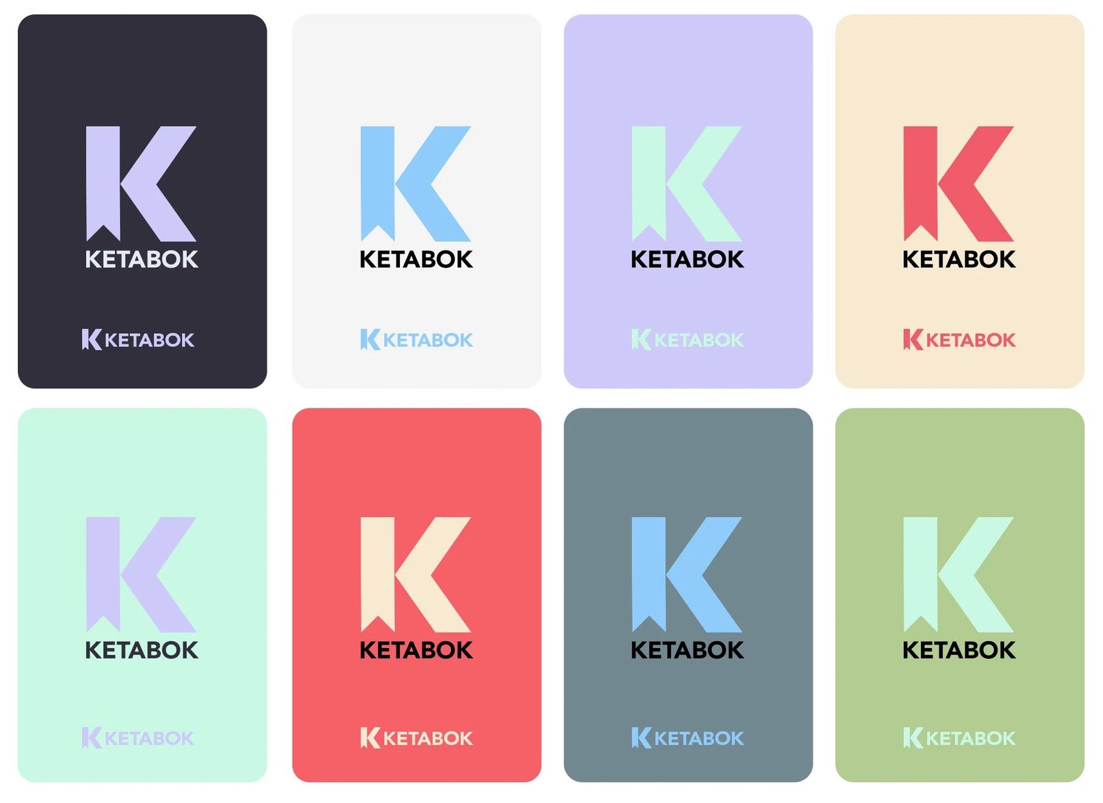
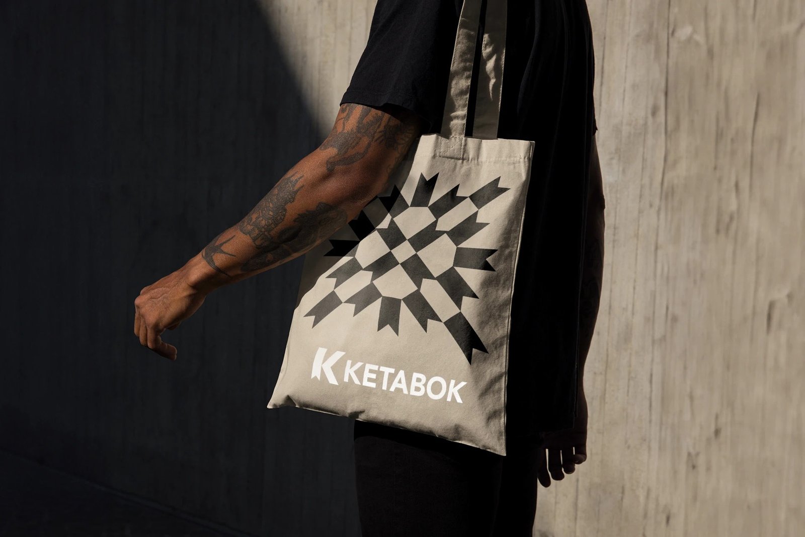
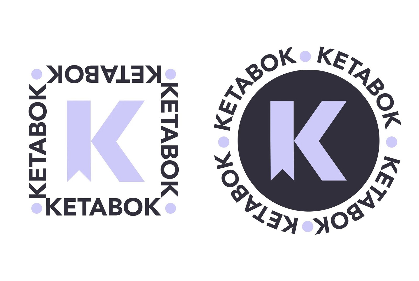
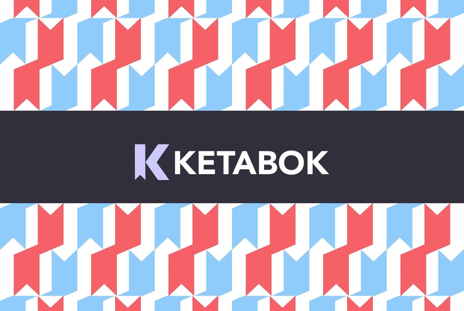
An education-sector brand. I designed the identity system end to end — logo, colour and the full suite of brand applications.
Ketabook is an education-sector brand that needed an identity capable of representing a learning-focused product to both institutions and individual learners.
Brand Identity
Education brands often split the difference between playful and credible and land somewhere forgettable — neither serious enough for institutional buyers nor warm enough for everyday learners.
I designed the identity system end to end — logo, colour, typography and a full set of applications — aiming for something that reads as considered rather than corporate, so it works whether it's on a partnership deck or a student-facing screen.
— What I did
- Brand identity — logo, colour, typography
- Full brand application suite
— Selected work
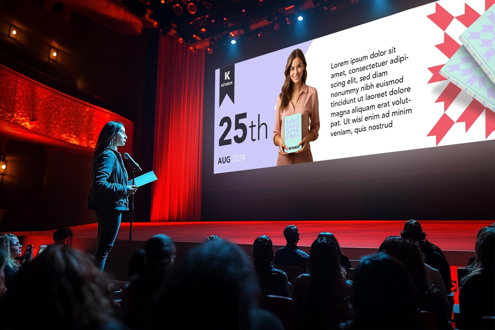
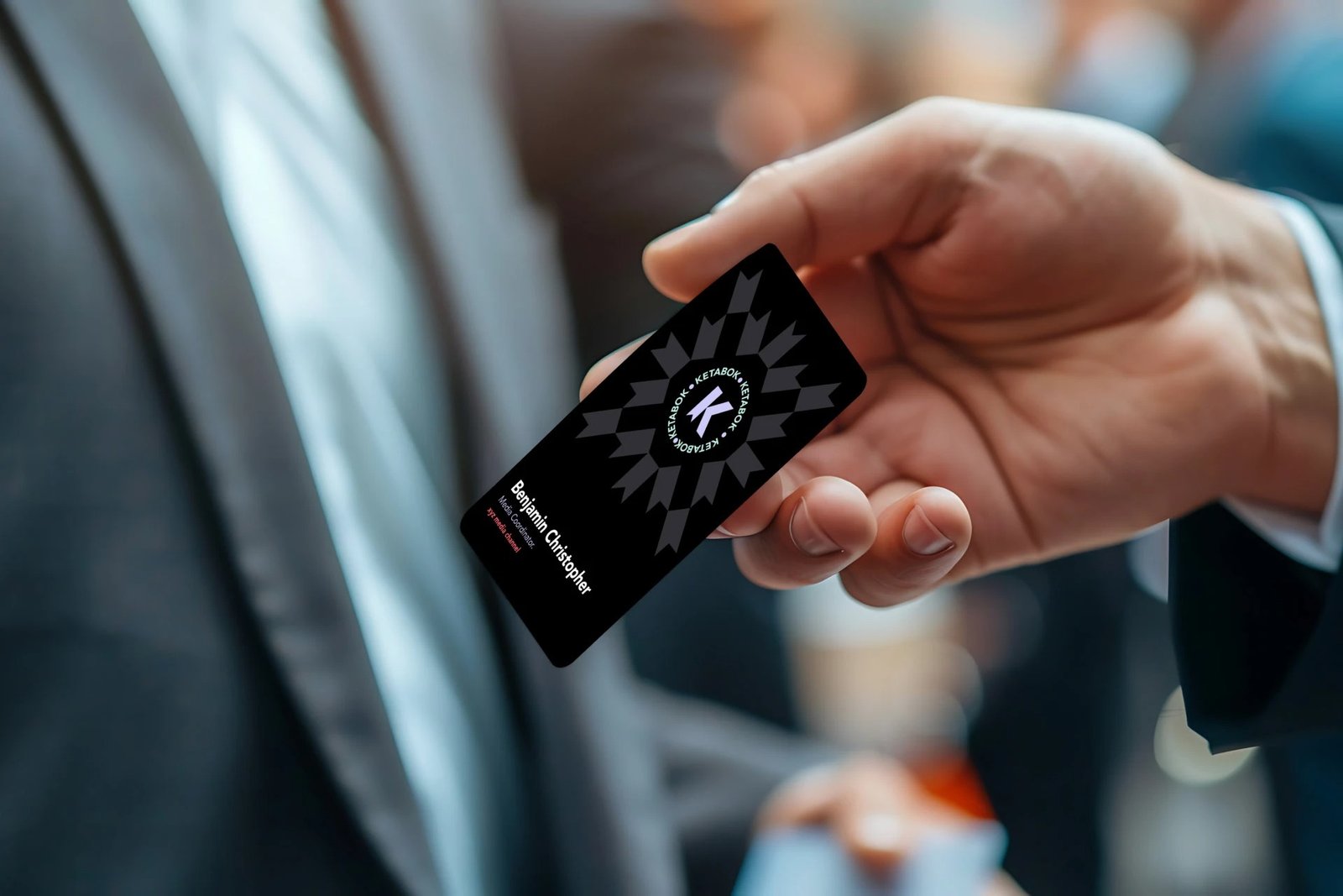

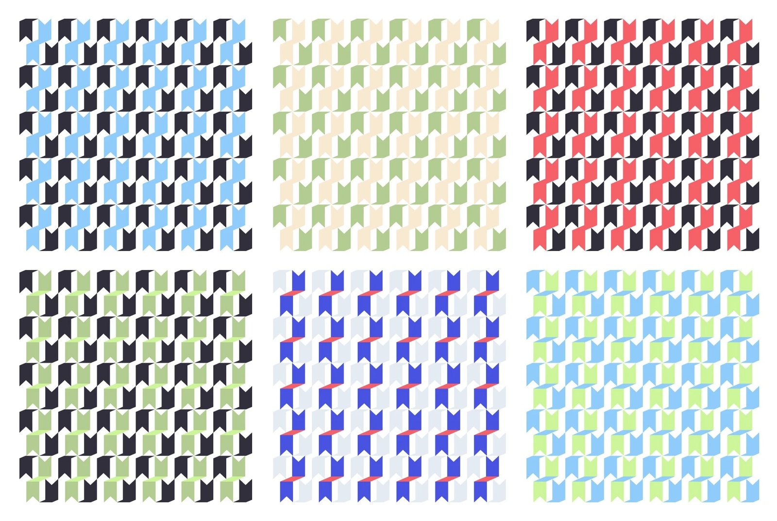
Get in touch
Let's build something worth shipping.
Email me at design@imkashif.com.
Or find me on LinkedIn.
Tell me what you're building over the next few steps, then pick a time straight off my calendar — no back-and-forth over email to find a slot.
Got it — pick whatever time works for you.
Rather not book right now? You're covered either way — I already have your details and will follow up directly.